Pulseline
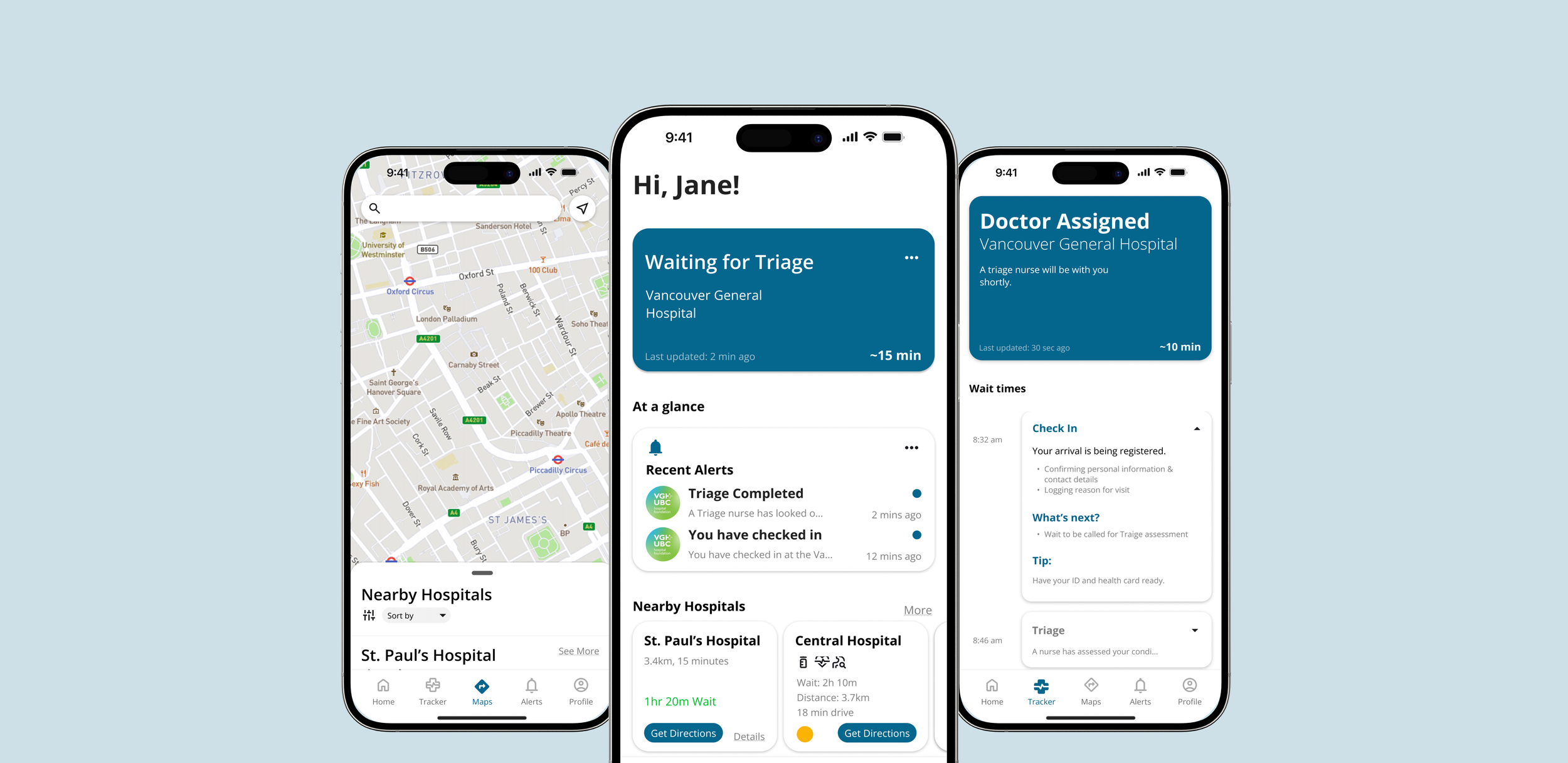
A mobile and in-hospital system that brings clarity to emergency care, reducing uncertainty, easing overcrowding, and improving hospital flow.
OVERVIEW
Role
Scope
Toolkit
Team
As the sole UX Designer, I led the end-to-end design process from problem framing to high-fidelity prototyping.
January 2024 - July 2024
Figma, Photoshop, Illustrator, Miro, SUS, Perplexity, Notability AI, Maze
Nathan Tsung
Emergency departments face long wait times and overloaded staff due to manual triage processes and poor communication systems. This creates frustration for both patients and staff.
How might we enable patients to better understand and navigate the emergency care journey, from decision-making to discharge, without adding burden to healthcare staff or disrupting existing hospital systems?
INTRODUCTION
SOLUTION
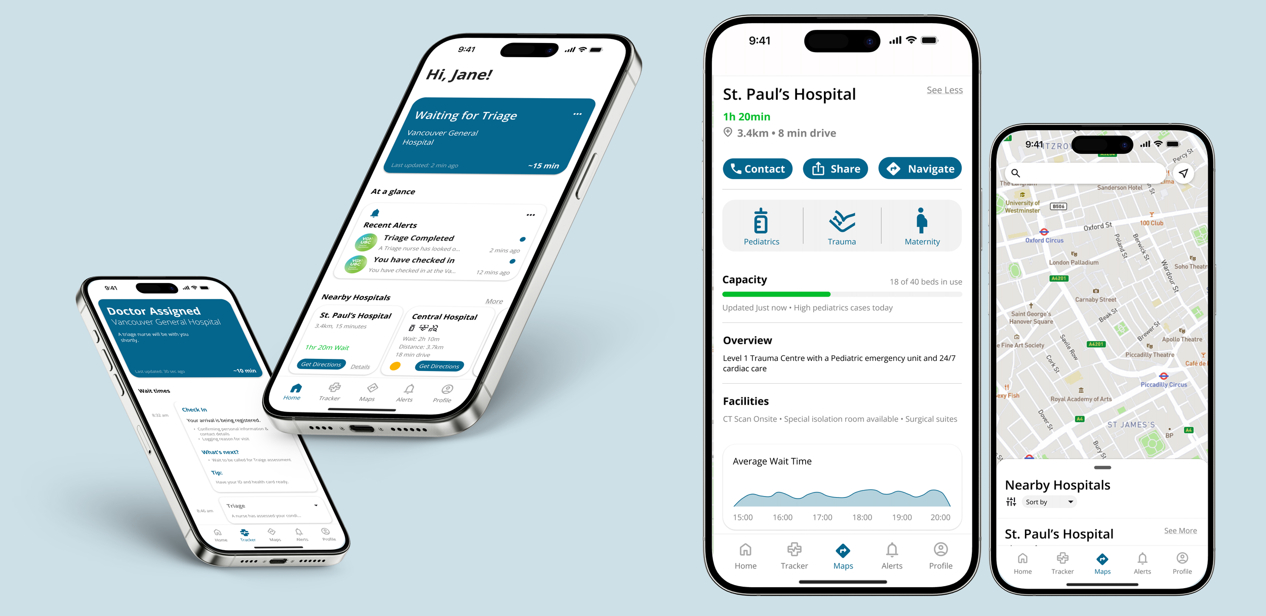
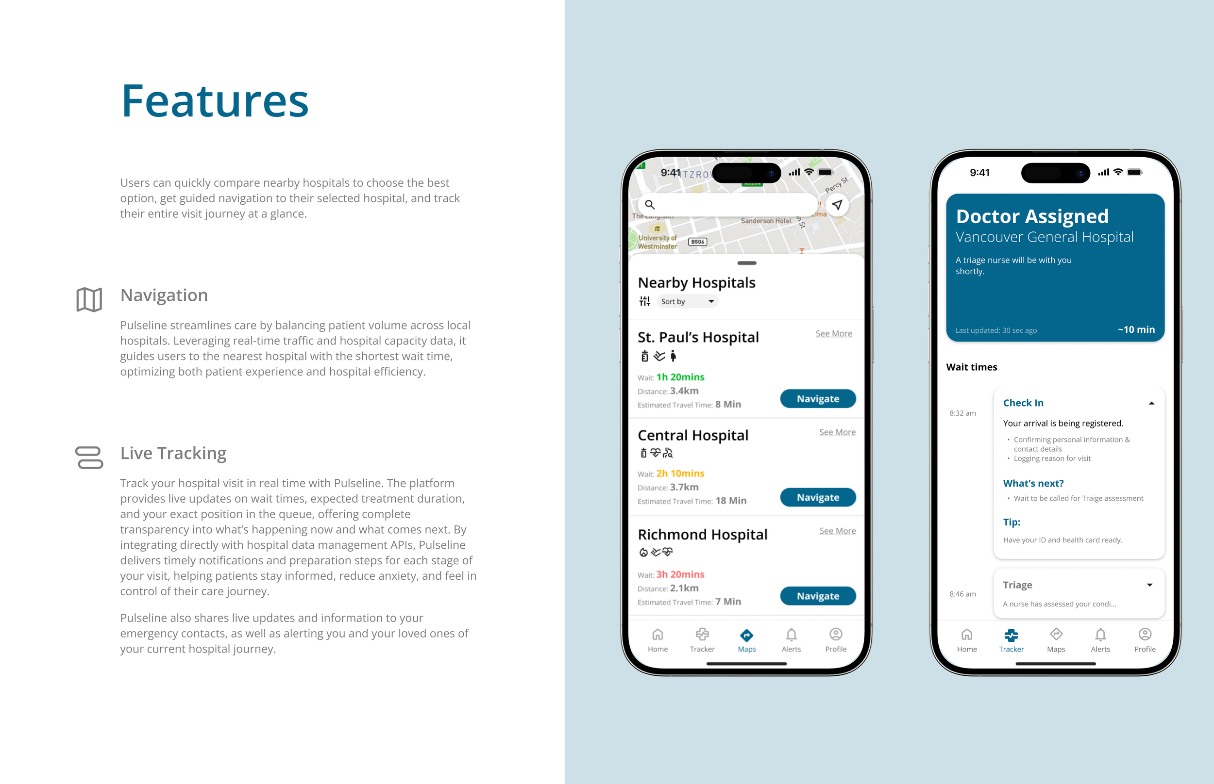
Pulseline reduces patient uncertainty and enables hospitals to distribute patient load more evenly, resulting in fewer bottlenecks and better patient experiences.
THE PROTOTYPE
This Interactive Mockup was developed to display the application’s full features and to communicate the purpose of Pulseline.
EXPLORATORY RESERACH
Understanding the chaos of emergency care
To design effectively, I first studied the ER environment — chaotic, high-stress, and easily disrupted by small workflow changes.
I reviewed hospital and triage tools in Canada and abroad, finding many outdated, poorly integrated, and misaligned with staff workflows or privacy needs.
I then interviewed frequent ER patients and local nurses/nursing students.
Here’s what I found:
-
Many patients expressed feeling lost once checked in, unsure of when they’d be seen or what would happen next.
-
Several users said they weren’t always sure whether they should go to the ER or not. They wanted a simple, guided way to assess their symptoms and make more informed decisions before heading in, potentially avoiding unnecessary visits and easing hospital congestion and fees.
-
Users expressed a need to reference previous symptoms, diagnoses, or wait times especially those with chronic conditions or caring for family members. Being able to see visit history and trends helps patients advocate for themselves and prepare better for future visits.
Design Reflection
Talking to patients and nurses showed me that emergency care isn’t just about treatment it’s about the anxiety of the unknown. People weren’t upset only by long waits, but by not knowing what they were waiting for. One patient said, “You just sit there and hope someone calls your name.” It reminded me that sometimes the most powerful role of design is simply to bring clarity.
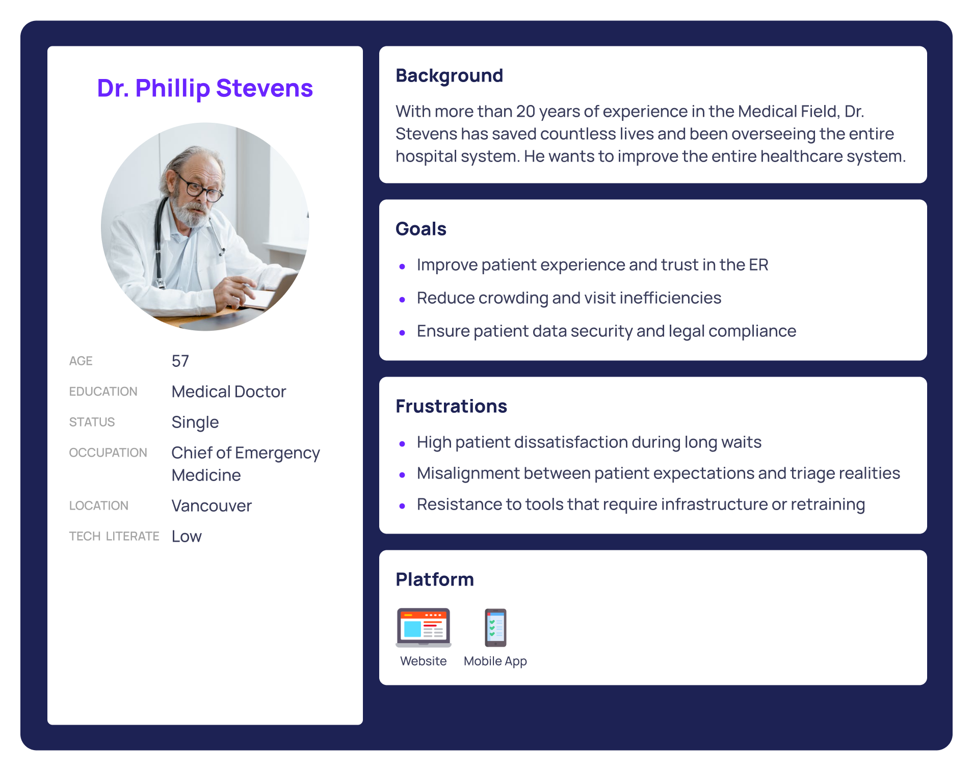
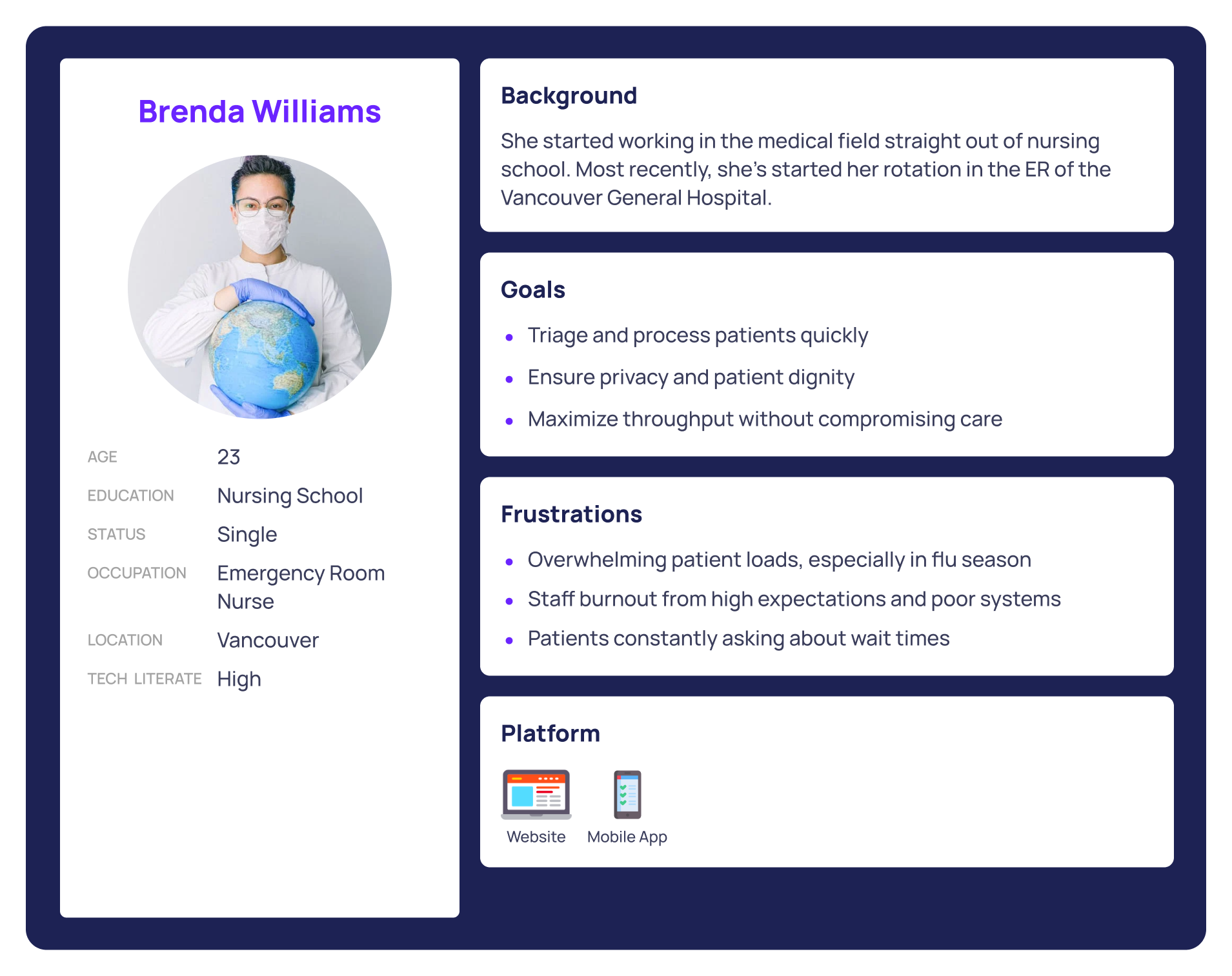
Focusing on patients, nurses, and hospital administrators - the 3 personas

SYNTHESIZING KEY FINDNINGS
Systematic Gaps, Human Costs
-
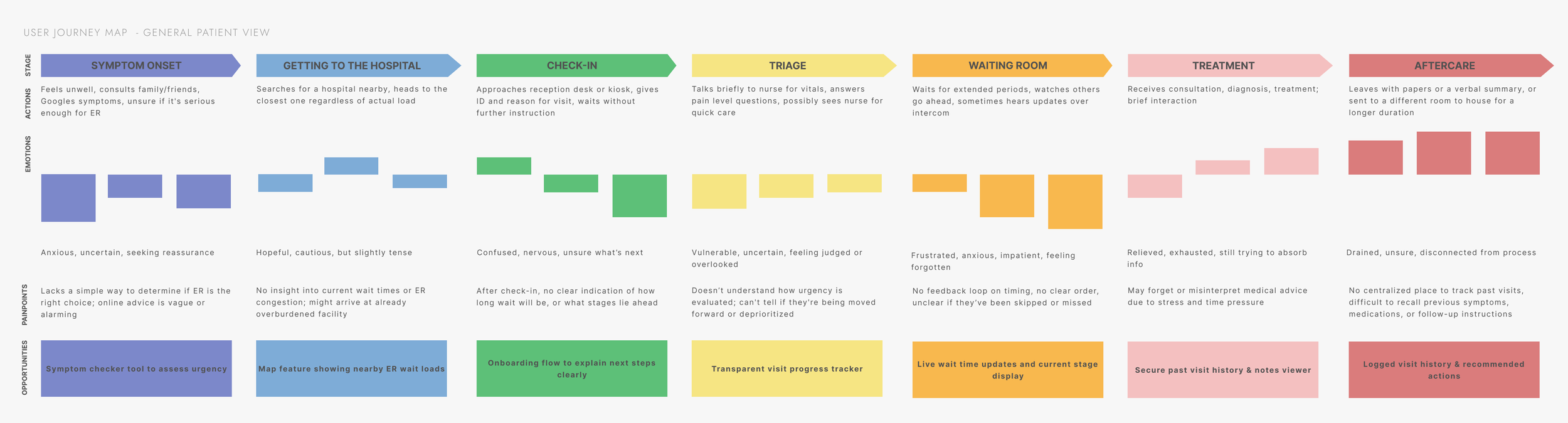
From symptom onset to discharge, patients consistently reported a lack of transparency. They don’t know where they are in the treatment process, how long they’ll be waiting, or what to expect next, leading to anxiety, frustration, and mistrust in the system.
-
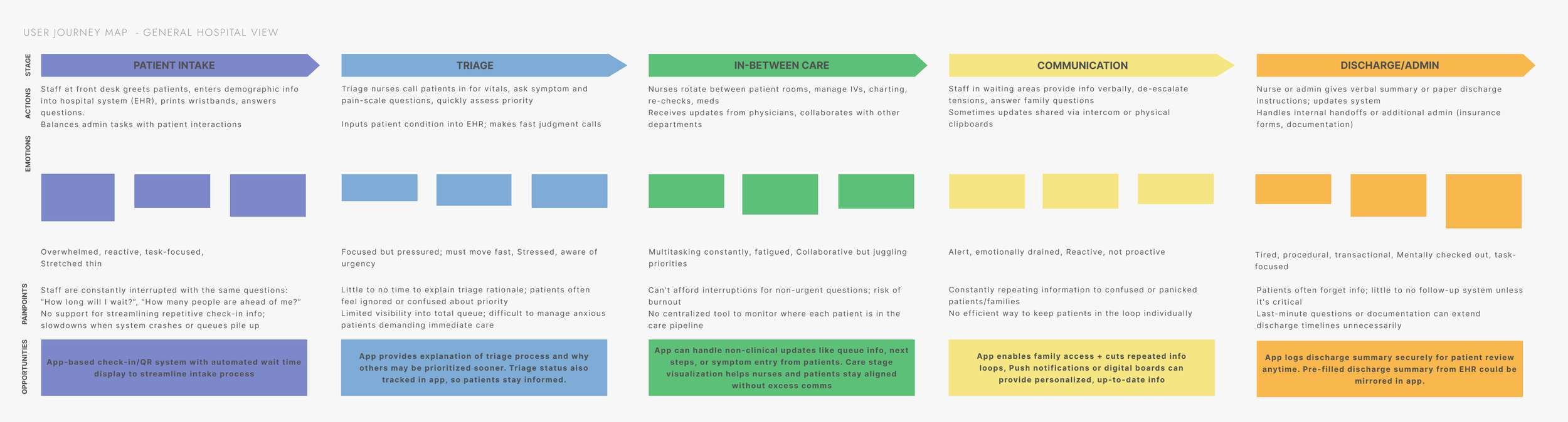
Nurses and admin staff are repeatedly interrupted by the same questions from patients and families. This not only slows care delivery but adds to emotional burnout. There is a clear need to offload non-clinical communication in a way that doesn’t disrupt their workflow.
-
The patient journey and the hospital workflow exist in parallel — but they rarely intersect. Patients feel forgotten, and staff feel overwhelmed. There’s no shared visual or information layer that helps both parties stay aligned throughout the care journey.
These personas helped us map out distinct user journeys, from pre-visit decision-making to in-hospital check-in, treatment progress, and follow-up. Their needs and pain points grounded every step of the design process, allowing us to build a system that supports patients with clarity while respecting the realities of hospital workflow.
Designing clarity into a complex system
I reviewed hospital tools and health apps, finding most favored administrative efficiency over patient experience, revealing an opportunity to bridge both.
Studying ER layouts, intake processes, and user mental models showed how much information could be added without overwhelm.
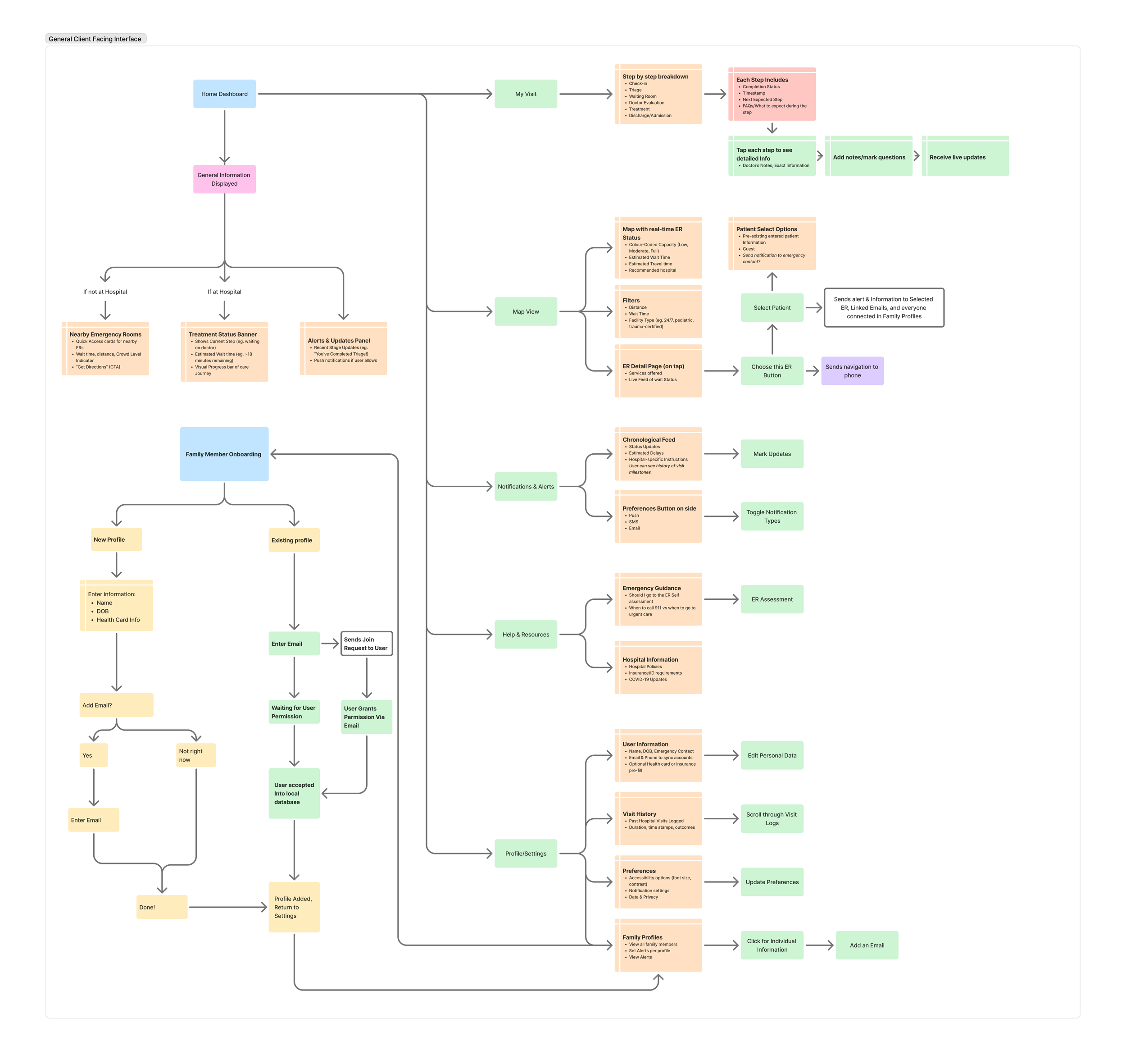
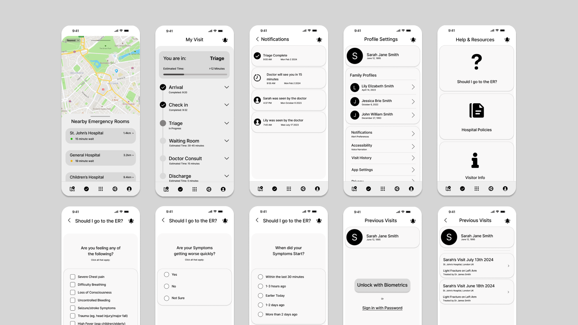
From this, I built an information architecture for stage-based care progress, symptom self-assessment, and live wait-time visibility, then created quick low-fi wireframes to test the concept.
DESIGN AND EXPLORATION
VALIDATION AND REFINEMENT
Testing low-fidelity prototypes with real users in real contexts
To validate usability, I built low-fidelity wireframes simulating check-in, visit tracking, symptom input, and ER status mapping.
I tested with 5 participants;
2 ER nurses,
2 frequent patients, and
1 UX designer
all of whom completed tasks like checking ER status, logging symptoms, and reviewing visit history. Sessions were remote and followed by a survey to capture feedback.
I approached this user testing cycle with a set of hypothesis based on user needs and hospital constraints. These informed t he core design features and testing goals, ensuring that the solution was both user-centric and operationally viable.
-
If we provide patients with a visual Active Visit Tracker that outlines key stages of their ER visit (e.g., triage, waiting, diagnosis, treatment, discharge), then they will feel less anxious and more informed, because they can mentally prepare for each step in the process.
Validation metric: Users report a clearer understanding of where they are in their care journey and what’s next via post-test surveys and interviews. -
If we display automated status updates and FAQs through a patient-facing app (e.g., wait time estimates, symptom input confirmation), then patients will ask fewer repetitive questions to nurses and admin staff, because the system will proactively address common concerns.
Validation metric: Fewer “Where am I in the process?” or “How long will it take?” questions during observation and interviews. -
If we allow patients to self-report symptoms digitally through a simple interface before seeing a triage nurse, then they will be able to better articulate their concerns and feel more in control, because they can do it at their own pace and in their own words.
Validation metric: Participants report higher confidence in how their symptoms were communicated; triage staff note greater clarity in patient summaries.
-
If we provide patients with real-time hospital status visibility (e.g., current wait times, crowding levels, and alternative nearby locations), then more patients will choose less crowded hospitals when appropriate, helping to distribute patient load and reduce pressure on overwhelmed staff, because patients often lack access to this information when making care decisions.
Validation metric: A measurable percentage of test participants express willingness to choose a less crowded hospital when provided with different data.
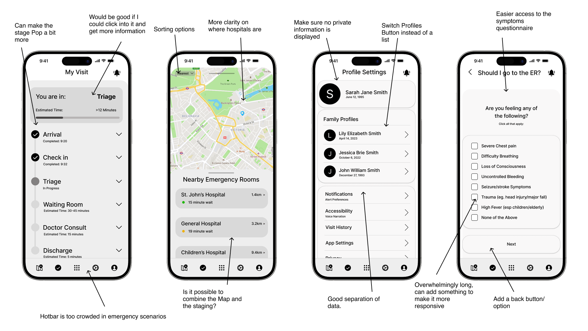
Critical Findings
-
I originally imagined a shared family view of ER visits, but in practice, healthcare privacy laws are strict and vary by region. Minors in particular can legally withhold information from guardians, and doctors must respect those boundaries. This forced a complete reevaluation of how user data is accessed, shared, and stored, especially in multi-user households.
-
ER staff don’t have time to learn new systems or enter extra data. If a product adds friction, it won’t be used, no matter how helpful it might seem. The solution had to operate quietly in the background, sourcing data passively or through patient self-entry, not by adding work to already stretched teams.
-
To avoid adding burden to nurses while still enabling smarter triage visibility, patients had to take ownership of symptom reporting. This also meant simplifying medical language, building progressive question flows, and making it feel more like a conversation than a form.
-
Patients want to feel informed, not flooded. During testing, too many updates or overly technical status screens caused confusion. The solution was to show just enough: what stage they’re in, what’s next, and why they’re waiting. Simplicity over thoroughness.
Design Reflection
At first, I saw the challenge as reducing wait times and anxiety. But conversations with nurses and patients showed that strict legal, emotional, and procedural rules limited what could be changed. Design here risked becoming a burden if it added complexity. Real value meant building trust, respecting boundaries, and bringing clarity to an overwhelming system.
TEST RESULTS
ITERATION TWO
In this iteration, I explored automating triage, a complex challenge that quickly proved to be its own standalone project. Feedback from healthcare professionals confirmed it required deeper research than this scope allowed. Still, the exploration shaped the final design and helped define which features were essential.
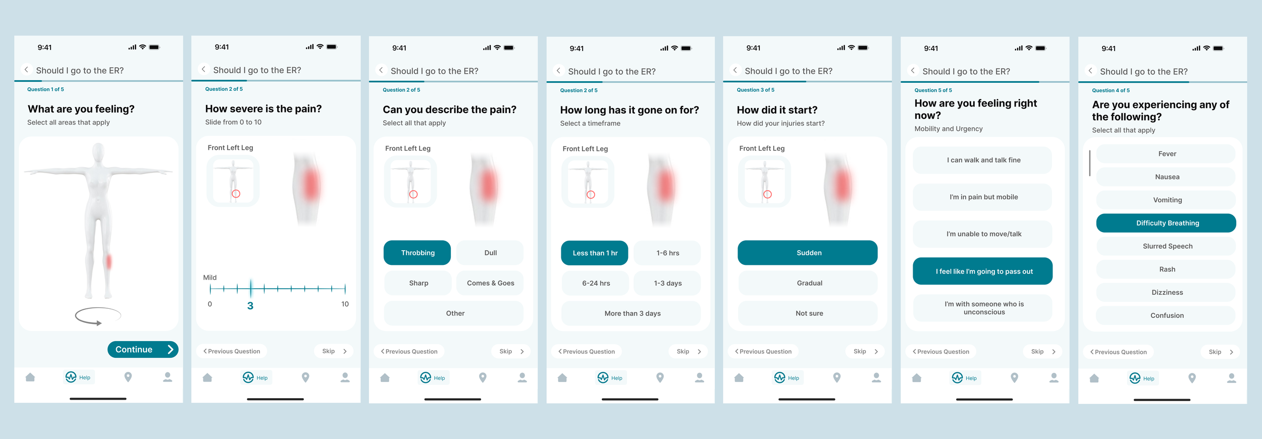
Refining the ER experience: Testing clarity, usability, and trust in a patient-first redesign
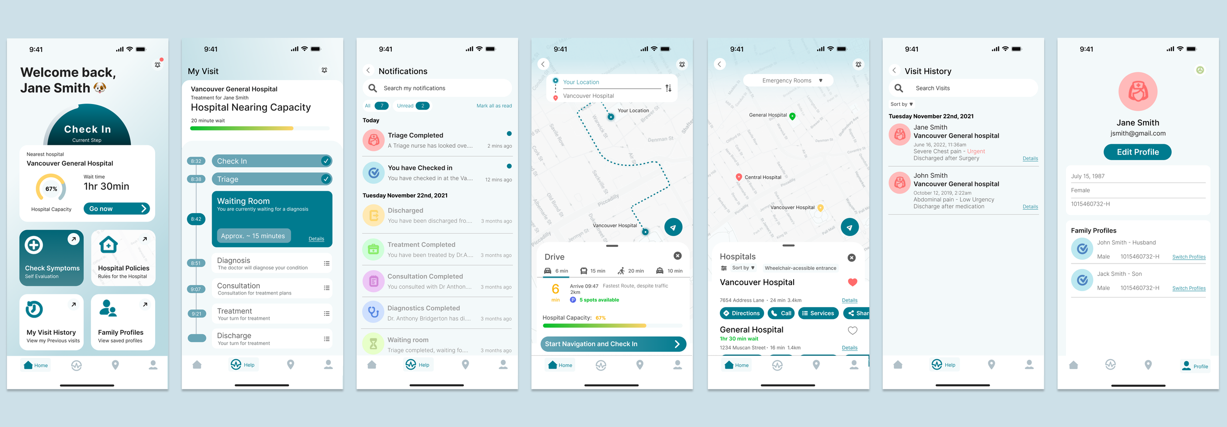
The second iteration of Pulseline focused on simplifying layout, interactions, and hierarchy to improve clarity and reduce patient stress. It continues to guide patients from symptom check-in to real-time treatment updates and visit history, while minimizing staff disruption. This version is now ready for further usability testing with evaluations and interviews.
TEST RESULTS
Clarity through Reduction: Re-Scoping the project
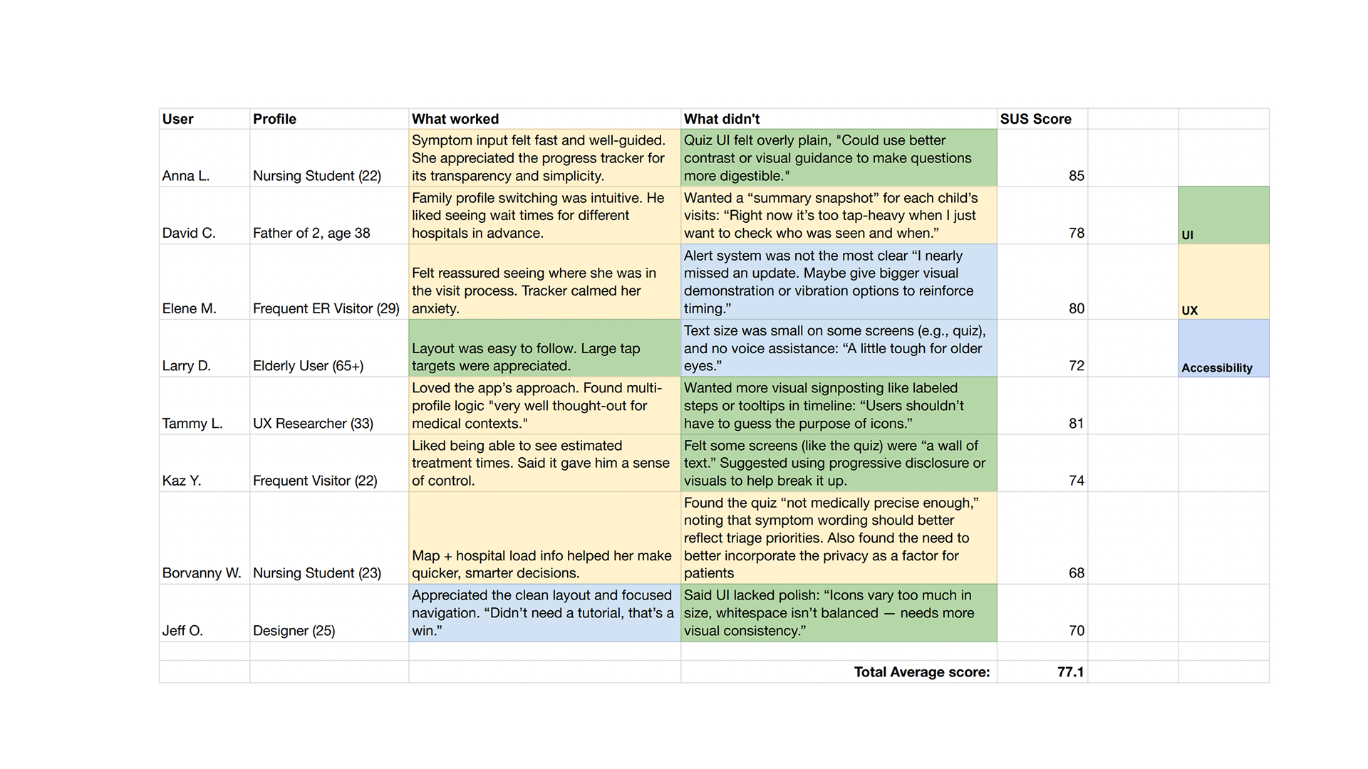
In the final testing round, I ran 1:1 sessions and SUS evaluations with healthcare professionals and ER patients to validate the prototype against the project’s three key goals. The results were eye-opening, revealing several unexpected insights.
-
While early designs emphasized a broad suite of tools (e.g., hospital maps, ER comparisons, family profiles, etc.), users overwhelmingly responded most positively to features directly tied to their immediate ER journey. Tools that didn’t serve the “right here, right now” experience often went unused or confused first-time users.
-
The Active Visit Tracker and hospital tracking were consistently highlighted as the most valuable tools bringing emotional relief by offering clarity and making patients feel "seen" in the system. Alongside that, hospital tracking allowed for a relief of pressure from the hospital team.
-
Push updates, especially ones indicating where the patient was in the treatment journey, were cited as a comprehension force. However, participants also noted that too many updates would feel overwhelming, so notification frequency needed to be balanced.
-
These features were appreciated by users who had chronic conditions or were supporting family members. However, for most patients, these were supporting tools, not daily-use components. Their UI placement was adjusted accordingly. Since it went beyond the baseline scope of this project, I opted to abstain from making further progression in their user flows.
Final testing showed the need to focus on fewer, stronger features. The app was re-scoped to three core components:
Location Mapping — Helps patients choose the right hospital based on needs and ER load.
Active Visit Tracker — Real-time updates on wait times and next steps.
Notifications & Visit History — Stage-based alerts with past visit data for context.
I designed Pulseline as a patient-first, privacy-conscious platform that brings clarity to the chaos of emergency care. Built to integrate seamlessly into real hospital workflows, it empowers patients with live treatment tracking, simplifies triage through symptom-led input, and protects confidentiality by design.
Early on, I overlooked two realities: strict patient confidentiality and the heavy workload ER staff face. My first designs assumed hospitals could easily adopt new tech and patients could freely share data.
Feedback from nurses and patients proved otherwise, leading me to redesign Pulseline to respect privacy laws, store data locally, and avoid adding staff tasks. This taught me that good design in complex systems must balance usability with feasibility, compliance, and humility.
I also see potential for Pulseline in veterinary care, where similar needs exist.
CONCLUSION